%201.png)
Available for work


My Role
Led end-to-end experience design across platforms, collaborated on user research, defined interaction patterns.
Team
Lead Designer
Sarthak - PM
Anurag and Shruti - Web Developer
Project Brief
Redesigning Kapiva’s US PDP to address trust concerns, highlight delivery & authenticity, and drive retention through Subscribe & Save.
Designing for the US Market: Increasing LTV Through Subscriptions
Project Timeline: 2 weeks
Goals
-
Build trust upfront → Increase first-purchase conversion rate by X% within 3 months.
-
Increase retention & LTV → Grow subscription adoption by Y% and repeat purchase rate by Z%.
Before we get started, here’s a quick introduction to what Kapiva is.
Kapiva is a fast-growing Ayurvedic health and wellness D2C brand from India, offering modern solutions for nutrition, immunity, and skin health. By blending traditional Ayurvedic wisdom with a contemporary, science-backed approach, Kapiva has built a loyal following and serves millions of customers.
As the brand expands into the US, it aims to make Ayurveda accessible to a new audience, introducing its natural, effective health solutions to people seeking trusted, holistic wellness options.

My Approach
Step 1 — Align on outcomes with PM & Business
Defined goals with PM: boost retention/LTV through subscriptions, improve PDP → Checkout, and reduce bounce. Agreed on success metrics and constraints.
Step 2 — Understanding User Pain Points
Analyzed 3 months of CS tickets; top concerns were delivery uncertainty, product quantity, and authenticity. Translated into hero requirements: shipping info, clear dosage, strong trust signals.
Step 3 — Competitive analysis (US D2C wellness)
Audited health & D2C PDPs to spot best practices and trust gaps Kapiva needed to solve.
We’ll first walk through the PDP hero section — how we addressed key user concerns and built trust — before zooming in on the Subscribe & Save widget as a highlight of this redesign.
Alright then. Let’s get to the main part of the case study ✌️
Hero Section
I was tasked with redesigning Kapiva’s PDP for the US market. The existing page had an outdated design, outsourced to an external agency, and was not performing well in terms of user engagement or subscriptions. My goal was to modernize the experience, build trust with first-time buyers, and create a subscription-first flow to increase retention and LTV.
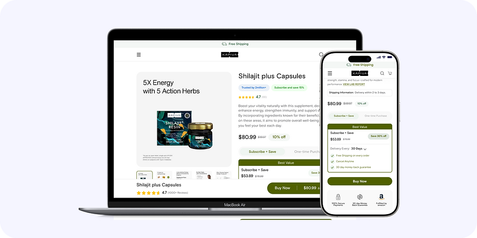
Let me quickly show you the old and the new design before I dig deeper into the design decisions that I took.


Tackling User Concerns in the Hero Section
Let me walk you through the main issues we identified in the PDP hero. I spent a lot of time with the Customer Support team, reviewing three months of tickets to understand the top complaints. The main pain points were:
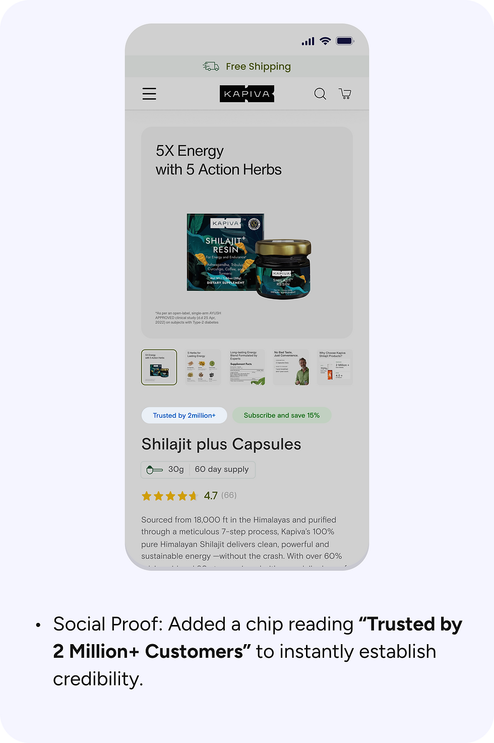
Trust & Authenticity: Users were unsure if the product was genuine.
Quantity Skepticism: Many felt the product looked “too little” for the price.
Delivery Uncertainty: Users had no clear indication of shipping timelines on the website.
To address these concerns, I incorporated design elements that guide users and build confidence before they reach the CTA.
Trust Building
Clarity on Quantity & Delivery

Subscribe & Save Widget
This widget lived in the PDP hero but offered minimal information—just a radio-button toggle labeled "Subscribe & save (Save 20%)" beside “One-time Purchase.” It lacked context, hierarchy, and reassurance—so most users overlooked it or didn’t feel compelled to opt in.
Problem
The existing widget fell short in multiple ways:
Insufficient context → Users didn’t understand the value or commitment involved.
Discount clarity missing → Beyond “Save 20%,” there was no clear comparison or pricing detail.
Not scalable → The UI didn’t allow for more options like multiple frequencies or perks.
Not scalable → The UI didn’t allow for more options like multiple frequencies or perks.
No default selection → Users always had to manually choose, which hampered adoption.
These issues directly impacted subscription adoption, retention, and long-term value (LTV) goals.


We intentionally avoided showing trending terms at this stage — users are already focused on their own query. Introducing trending items here could distract from their flow instead of assisting it.
Goal
The objective was clear: redesign the widget to make subscriptions feel like a beneficial and flexible choice—without overshadowing the one-time purchase—ultimately boosting LTV and retention in the new US market.
My Approach

By addressing the lack of context, poor scalability, and unclear value in the old widget, the new design simplifies decision-making and guides users toward the subscription option with confidence. This not only improves the overall user experience but also directly supports the business goals of increasing LTV and retention.
One Time Purchase Widget
The business goal was to increase Average Order Value (AOV). To achieve this, me and my associate explored multiple approaches to encourage larger purchases. Some ideas were considered but ultimately rejected after evaluation:
Forced Minimum Quantity – making 2-packs the minimum. This risked alienating first-time buyers and reducing overall conversions.
Aggressive Cross-Selling Bundles – pairing the product with unrelated items. This added cognitive load and distracted from the core decision.
and many more!
After evaluating these, we decided to focus on a simpler, more user-friendly approach: introducing clearly structured multi-pack options within the widget itself. This balanced user needs with business goals and set the foundation for higher AOV.
Impact of the PDP:
-
Increase in retention with an AOV rising from ₹1,200 to ₹1,500 driven by multi-pack nudges.
-
+22% uplift in subscription adoption, boosting LTV and retention.
-
−12% reduction in PDP bounce rate with stronger social proof and transparency.